
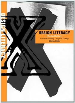
I love design. Early in my career, my first NCTE actually, I stumbled upon a museum exhibit celebrating the work of Stephen Heller. I picked up his book Design Literacy.
It helped change the way I think about how we #teachtheweb. Since that moment I have considered how opening up the tools of design to the masses will alter the way we read and write the web. Colors, fonts, white space. These all affect meaning as much as copy.
So I was excited for today’s Web Literacy Map Call. We were going to discuss and try to resolve separating design and accessibility and combining infrastructure and and web mechanics
I am not qualified to speak on the latter (Nor am I on design but I was most excited about this). Especially after reading what Jess Klein posted about the Mozilla’s Design Team’s Dino Dribble. Design Matters. Accessibility matters. Lets flesh them both out.
Then came infrastructure and web mechanics. They got tangled in the nets of last weeks vote to not change the grid layout of the Web Literacy Map.
We were letting design determine what Ian called our nomological net rather than letting what we are trying to capture determine our design.
The Tale of Two Questions
The vote of 1/29
It isn’t that we don’t need to attend to web mechanics and infrastructure. I think logically we can determine where these competencies fit (s0meone just tell me what a web stack is please). It was the rationale behind the move that I question. You see on the map if design and accessibility are separated under building then the balance of the the grid would be upset. Building would have six competencies and exploring and connecting would have five.

so…If infrastucture and web mechanics were combined and housed under exploring then balance would be restored. Three strands and five competencies a strand. Except this is web ltieracies not Feng shui.
I am not saying web mechancis and infrastructure do not belong together. They probably do. They may even belong under the nomological umbrella of exploring, but lets determine this by logic not design.
The Vote of 1/22
I could not be on the actual call and the mopad at the same time. So I lurked. We were voting not to change the design of the Map in Version 1.5 (listen to the audio…fascinating stuff). I voted for this motion (in fact I times infinitied someone’s +1000 on this vote). I want to move logically and consider the strands, competencies, and skills of the Map.
That does not mean I will not be pushing for a redesign in Version 2.o. To me that would require a new version launch.
I did learn some shocking news during the 1.22 call . The Map exists, in all its grid like wonder, because it had to fit on a PowerPoint slide.
Really. We are going to let the constraints of PowerPoint determine something this important? That is thinking inside the box. I mean literally thinking inside the box.
We should let the fish we are trying to catch define the size of our net and not let the design of our nets determine where we can cast.
In the long run I do not favor a grid like approach. The web moves too fast to fit in a box. Plus it makes us do silly things like try to force constructs together to protect the grid.
We need a modular approach to the Web Literacy Map. Something hackable and remixable on the fly. In response to the mobile MozFest challenge (about six months late) to re-envision the map.
I suggested this (some competencies came off):
I tried many shapes during the design challenge. Only the grid and the regular hexagon seemed to work. Every other shape lead to different surface areas for different competencies. Size would then be interpreted to determine meaning.
I am not saying I only want hexagons. I am saying is that this is a more modular design that would not force us into making what maybe a good decision for the wrong reason.
Let’s Play What If
Plus now some what ifs. What if in Version 2.0 we stop thinking about a 2-D design altogether? Why can’t the Map be a light weight mobile web app that played well on FirefoxOS?
There could be an official release. Maybe you click on a competency and the skills pop up as well related pathways to other strands. This could be a great way to combine Laura Hillinger’s Pathways Spreadsheet with the Web Literacy Map.
What if the Web Literacy Map 2.0 worked like an etch-a sketch?
If you hit a button all the competencies and strands fell to the bottom. Then the user could drag and drop then back into place to fit their current #teachtheweb maker challenge. Since we are no longer using rectangles we would no longer be limited by the four cardinal points. Mentors could quickly map out their learning across the strands.
What if the strands and competencies were also printed as tokens localized to different languages?
Mentors could use them in remote areas with little Web access. They could be tactile. They could be magnets. The map could be even more fun.
What if the map and the badges had a unified design? That would be pretty sweet as well.
Conclusion
I am energized by the Web Literacy Map and the Mozilla crowd in general. The calls have become great exercises into mental explorations. Doug has done a great job spearheading this effort and capturing the values of the open web.
Now we are all starting to blog about our thinking beyond the one hour weekly calls. The Discourse community is finally starting to pick up. Curriculum is being tested and developed.
It is an exciting time to #teachtheweb. I encourage everyone to join us. Everyone involved is proof that if you do not shut up even the most reasonabale people will start to take your silly ideas seriously.